👀
PROBLEM SPACE
Mobile traffic and usage on Ads Manager have steadily risen over time, encompassing all advertiser categories.
However, the "Mobile Friendly" experience is virtually absent, lacking optimization to support and fulfill the core proposition and emerging use cases.
OBJECTIVE
Increase activation & retention rates of our mobile-only users.
Improve feature set for our mobile-only & cross-device users.
Support emerging monetisation use cases where mobile is the first touch point.
Reduce the competitive gap in our mobile experience.
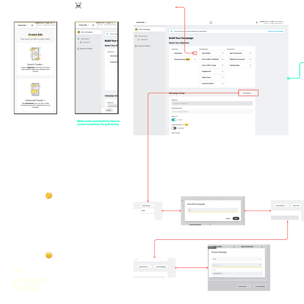
RESEARCH & AUDIT
I carried out an in-depth UX audit of the flows, while examining each design element and interaction.
By doing so, I identified areas for optimization and provided data-driven recommendations for the team to enhance the overall user experience on mobile devices.
These included :
Streamlined Navigation - Implementing a navigational structure for users to access campaigns and ad sets.
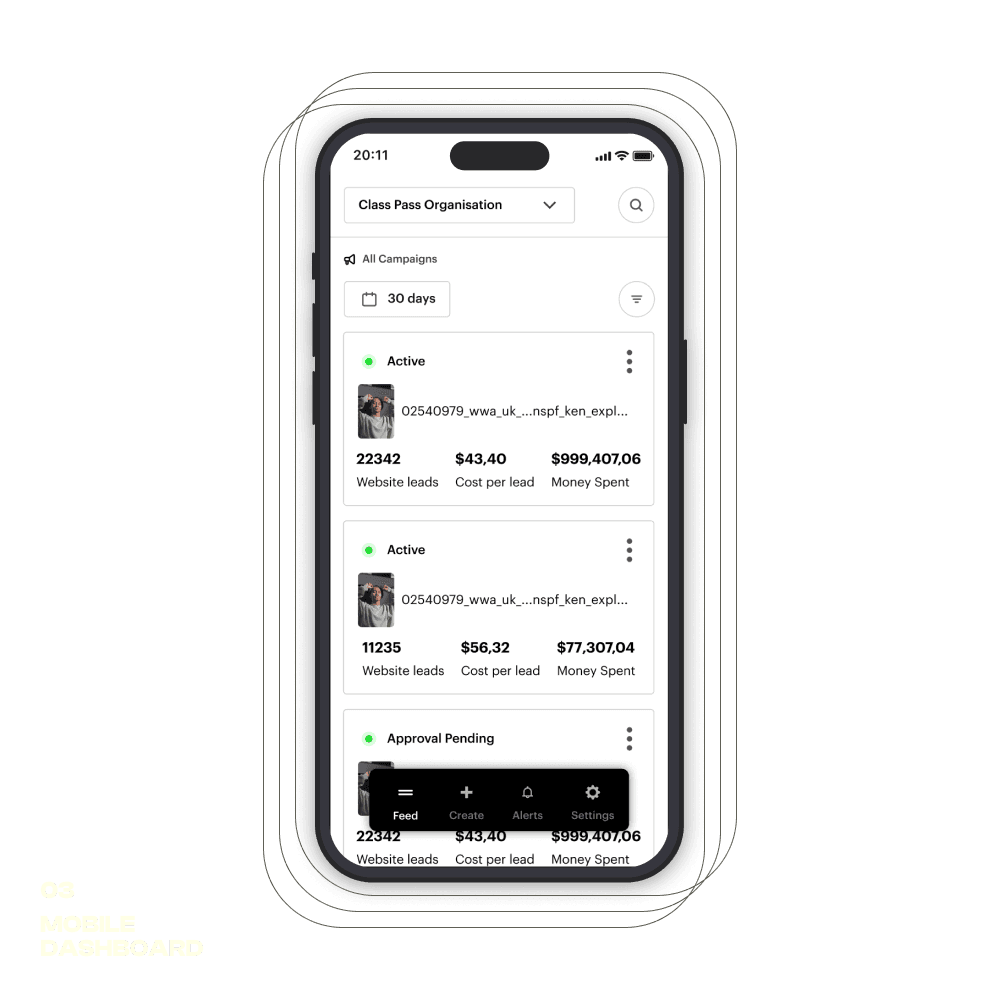
Dashboard Overview - A list of all active campaigns, offering users a holistic view.
Quick Controls - Give users the ability to toggle campaigns on/off and adjust budgets.
Notification Center - Real-time updates on campaign statuses and messages.
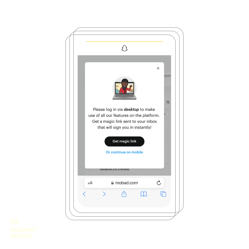
The Prompt
As one of the recommendations from the audit, I proposed an interim solution for users while the main project was underway.
This involved introducing a "prompt" that would appear for users attempting to access Ad Manager from a mobile.
We were confident in the appetite for mobile usage, as we actively tracked the "prompt" interactions, which demonstrated the demand for a more refined mobile experience.
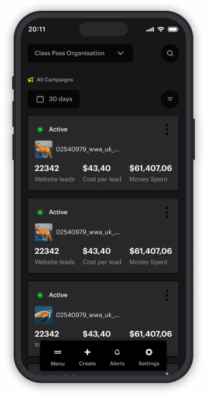
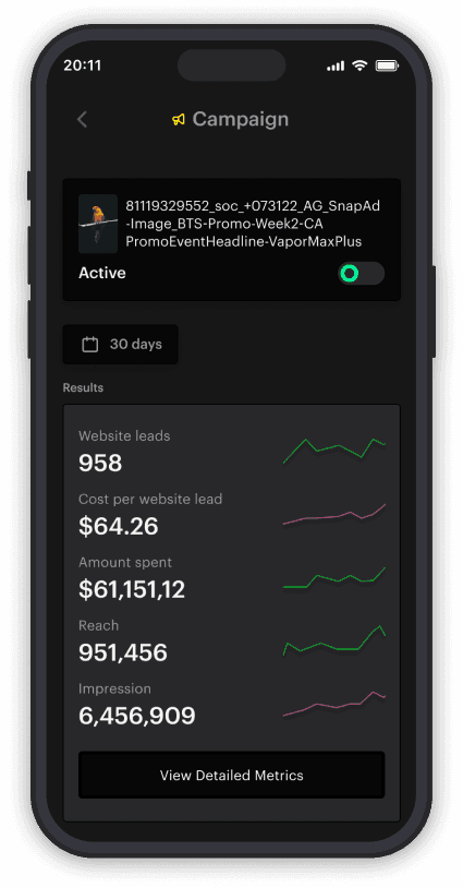
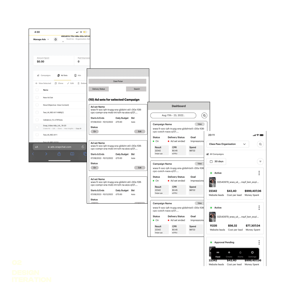
Dashboard
Campaign & Alerts
The campaign screens displayed key stats at a glance, avoiding information overload for users.
The notification screen included tips, onboarding information, and campaign alerts.
Browse the iterations for campaigns and alerts to understand the design progression.
SUMMARY
A prototype was created of the new design which was tested by the team and some external users.
This allowed me to quickly iterate on the flow and update accordingly. Some of the things that tested well were:
Navigation: Users easily moved between campaigns without confusion.
Dashboard: A card-style layout helped users check campaign statuses faster.
If I had more time on the project, I would do some further testing on the following areas:
Notifications and Alerts: There was still some confusion here around the type of notification versus onboarding card.
Campaign Analysis: Much more testing was needed here to map out user journeys.
Please feel free to check out the working Figma file.